Over the last few weeks, between rehearsals, work and repair cafes, I’ve been prepping different papers and exposing the Loughrigg image to try and find something I’m happy with. Whilst none of them are what I would hope to achieve, it’s been really useful in seeing what works and where I go from here.
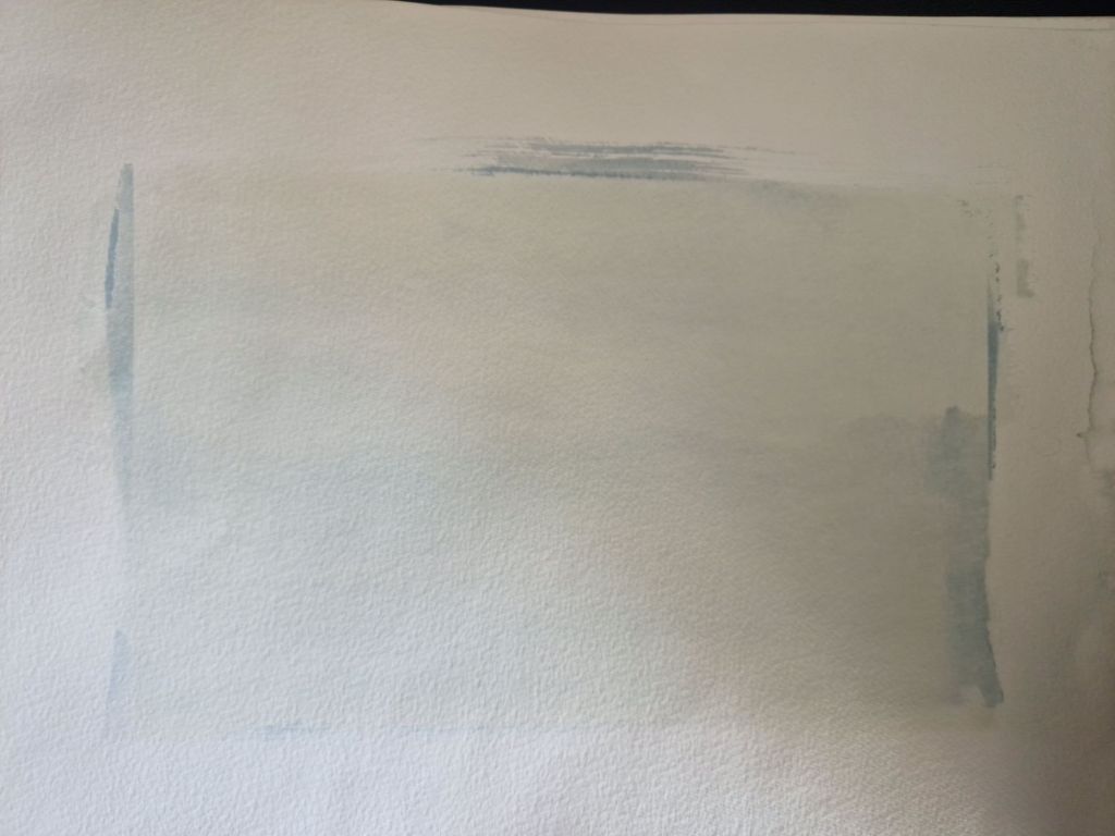
You can just make out the faint outline of the image above, but it was largely underexposed unfortunately.
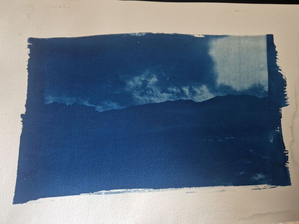
The next one I used some of the peroxide to enhance the development during rinsing and whilst, I felt it was overexposed, I LOVED the beautiful Prussion blue that appeared as it swished around in the tray.
While I was prepping some of the heavy watercolour papers, I snuck in some layout paper and a few pieces of kraft paper.

This was actually the summit stone, alothough it’s hard to see in this washed out image. What I enjoyed about this was the unexpected ease of rinsing. I fully expected it to disintegrate in the water, but to my pleasant surprise, it didn’t. It kind of crumpled like cloth hence why I think it dried with this crumpled appearance, but I actually love the final texture of it – almost like a cloth like feel. I may try this again with a longer exposure time and a peroxide rinse.
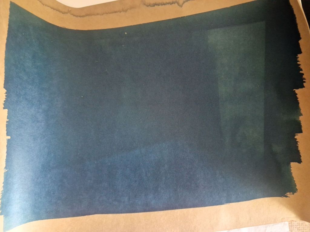
Not sure if the kraft paper was overexposed or it was just the result of the paper. This paper is extremely thick – almost like card but I loved the idea of using an earthy natural coloured paper for the background. It may be worth revisiting, but for now I’m going to stick with the whiter papers.
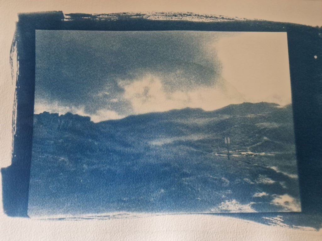
In terms of exposure and development, this came out almost perfectly, but if you look closely there seems to be a grainy appearance to the entire image. I think my preference is for more of a clean sharp outcome, but there is something rather nice about this grain.
I’m now working on editing and inverting the Orrest Head image and starting to formulate more concrete ideas for which images I would like to show, the orientation of them and other details.


Leave a comment